🔎 Basic Recipes for CS, PS, TS and GS
For an individual person, their CS is the difference between the value that they get from a good and the price that they pay for it:
For a group of people, add up the CS for each person who purchases the good.
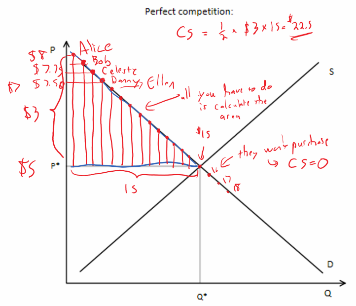
For a very large number of people, you can approximate the CS by calculating the following area:
- Above the Price Line
- Below the Demand Curve ← the value/reservation price
- To the Left of the last unit consumed
Producer surplus
PS is a lot like profit (it ignores fixed costs)
For an individual sale of a good, the PS is the difference between the revenue from the sale (price received) and the cost of producing the good:
For total Producer Surplus, just add up the PS from all items sold.
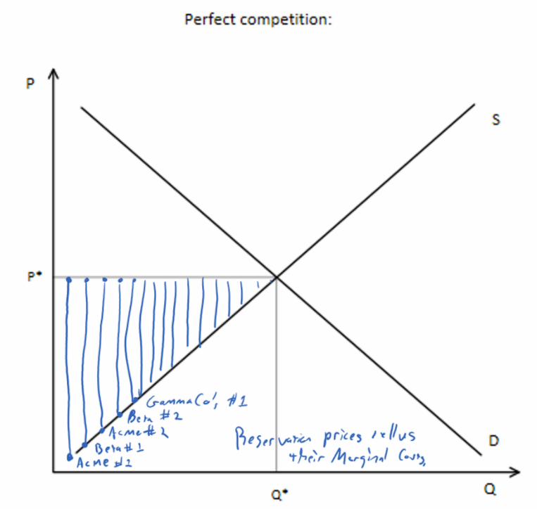
For a very large number of sales, you can approximate the PS by calculating the following area:
- Below the Price Line ← their revenue
- Above the Supply Curve ← their marginal cost
- To the Left of the last unit produced ← only units that are actually produced matter.
Total surplus = Social Surplus
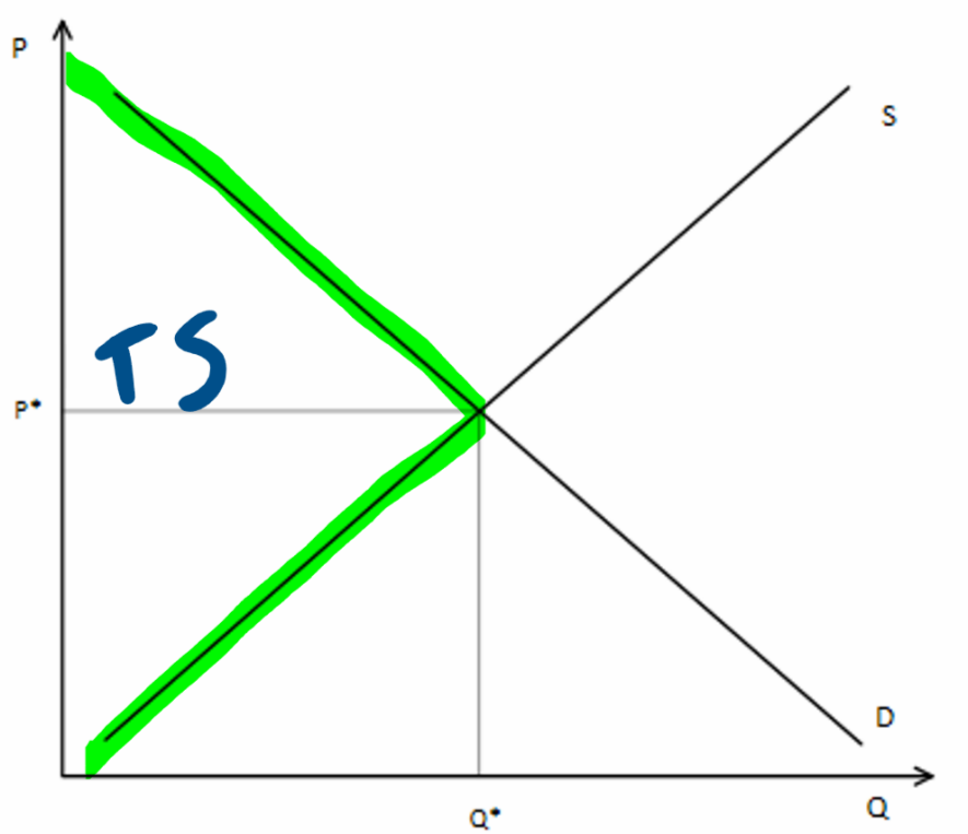
TS is just . Because CS and PS both have the price line as one of their edges, there is a shortcut.
For a very large number of sales, you can approximate the TS by calculating the following area:
- Below the Demand Curve ← CS
- Above the Supply Curve ← PS
- To the Left of the last unit produced ← only units that are actually produced matter.
Feedback? Email munger.e1010@gmail.com 📧. Be sure to mention the page you are responding to.