✏ "Solved Problem 3" - Internalizing the Externality
🙋 Bruce mentioned “Solved Problem 3.” What is that?
✔ Solved problem 3 is an example from a textbook. It is a helpful example that illustrates the concept of Internalizing the Externality, so I reproduce it below.
(In the following, quoted text and the two diagrams are taken from Hubbard and O’Brien, Economics, 6e.)
”Are Congestion Fees the Answer to Big City Traffic Problems?”
Section titled “”Are Congestion Fees the Answer to Big City Traffic Problems?””“When you drive a car, you generate several negative externalities: You cause some additional air pollution, you increase the chances that other drivers will have an accident, and you cause some additional congestion on roads, causing other drivers to spend more time in traffic. The externalities may be particularly large in big cities. In 2019, the average speed of a car in midtown Manhattan in New York City was less than 5 miles per hour, about the same speed as someone jogging. New technology makes it possible to identify individual cars and track the routes they take. Beginning in 2019, the state of New York began using the technology to automatically bill any car from a ride hailing service like Uber or Lyft a congestion fee, or tax, of $2.75 whenever the car traveled through midtown Manhattan.”
🙋 A student shared a link from a satirical news-site called the Onion. It claims that 98 Percent Of U.S. Commuters Favor Public Transportation For Others. This would allow each of us to have the road to ourselves, without the negative externalities from other drivers.
Part a
Section titled “Part a”✏ “Draw a graph showing the market for ride-hailing services in midtown Manhattan before the congestion fee was imposed. Indicate the efficient equilibrium quantity and the market equilibrium quantity.” [Just adapt the standard diagram representing what this is (a positive/negative production/consumption externality).]
✔ Click here to view answer
We solve part a by drawing the market for ride hailing services. There is a consumption externality/‘externality in consumption’ for ride hailing, so the marginal social benefit curve should be below the demand curve (which shows marginal private benefit). Because of this, the market equilibrium, QMarket, is greater than the efficient equilibrium quantity, QEfficient.
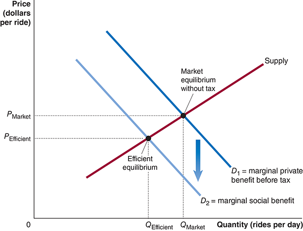
You shift the Marginal Social Benefit down by the external cost of the congestion caused by a single ride.
Part b
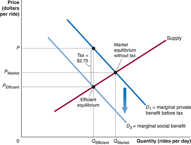
Section titled “Part b”✏ Assume that the $2.75-per-ride tax results in the efficient quantity of rides from Uber, Lyft, and similar ride-hailing services. Illustrate this result using your graph from part (a). Will the price that consumers pay rise by $2.75? Briefly explain.”
✔ Click here to view answer
The tax on consumers lowers consumer’s marginal private benefit curve (ie the demand curve) by the amount of the tax. Essentially, the tax cancels out some of their private benefit, lowering their net benefit and their willingness to pay by an amount exactly equal to the amount of the tax. The demand curve must shift down to match the marginal social benefit curve because the question states that “the $2.75-per-ride tax results in the efficient quantity of rides from Uber, Lyft, and similar ride-hailing services.” This is called “Internalizing the Externality.”
🙋 What is the story for total surplus?
See answer
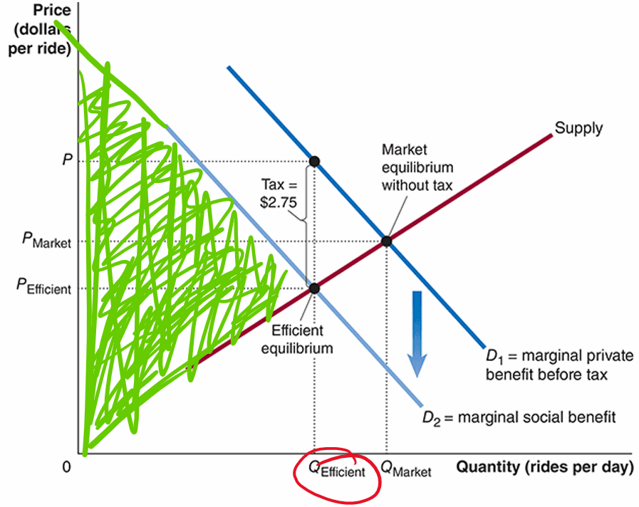
✔ Here is surplus before the tax. The green area represents positive contributions to social surplus. The red area indicates deadweight loss.

Here is surplus after the tax. There is no deadweight loss here, so the outcome is efficient.
Part c
Section titled “Part c”✏️ In pushing for the congestion fee, New York Governor Andrew Cuomo argued, “We have to pass a dedicated funding stream, so the [New York subway system] has the funding it needs. Congestion pricing is the only alternative.” Given that information, is it likely that the $2.75-per-ride tax will lead to an efficient equilibrium? Briefly explain by noting whether the demand curve for rides after the tax is imposed will be above or below the marginal social benefit curve and whether the equilibrium quantity will be larger or smaller than the efficient quantity.”
✔ Click here to view answer
The fundamental problem with a negative consumption externality is that people ignore the external costs when they consume goods. In this example, as we saw in Part A, drivers ignore the congestion they cause when they decide to use the roadways. As a result, they use the roadways more than the socially efficient amount. Specifically, they use the roadways when it would be more efficient for them to just walk. In this case, the marginal social benefit is lower than the marginal cost, even though the marginal private benefit is higher than the marginal cost.
In Part B, we saw that appropriately calibrated taxation could cause people to internalize the external cost of the congestion they create when they use the roads. For example, if the tax is exactly $2.75 and they cause $2.75 of harm to others, then the drivers will be weighing the costs and benefits in a socially efficient manner. The external costs of congestion will be internalized within their own decision process.
Key to the process of internalizing the internality is that the amount consumers pay in the tax must be exactly equal to the negative consumption externality they cause. For example, if we value the external cost at $2.75, then the tax must be exactly $2.75.
In the quote, the Governor suggests that the purpose of the congestion pricing is to raise funds for the subway rather than to solve the problem of people ignoring the negative externalities. This suggests that the actual tax is higher than the external cost. This would cause the demand curve to shift to being below the marginal social benefit curve. This would cause the equilibrium to move down the supply curve to a quantity that will be
smaller than the efficient quantity (QEfficient).
[Draw D3 below D2 and indicate that it is shifted downward by $2.75, noting that D2 is less than $2.75 below D1.]
Feedback? Email munger.e1010@gmail.com 📧. Be sure to mention the page you are responding to.