🔎 Back to the Omniscient Planner
Back in the lecture on Welfare Economics, we had the following slide. It shows that in perfect competition, the amount provided by the market () will be economically efficient. Perfect competition assumes that there are no externalities. Therefore, using the language from this lecture, without externalities, the market quantity is the efficient quantity: .
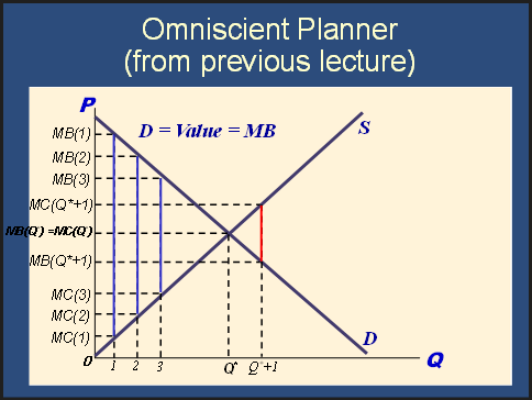
In this lecture, we should always keep the slide above in mind when we consider the difference between and . However, externalities cause there to be a difference between private benefits and social benefits (or between private costs and social costs). Therefore, we must update the diagram to acknowledge the potential difference between private and social costs/benefits.
Without externalities, the updated diagram looks like this:
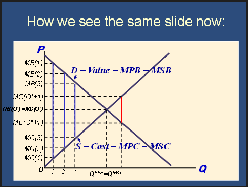
The diagram is updated in two ways:
-
With consumption externalities, there can be a difference between private benefit and social benefit. Therefore, rather than saying that the demand curve tells us MB, we discard the MB curve and replace it with both a MPB and a MSB curve. Without externalities, the demand curve tells us both MPB and MSB.
-
Previously, the market quantity was indicated by . Now, to make it clear that there is a difference between the market quantity and the efficient quantity, we indicate the market quantity with QMKT. We indicate QEFF separately.
🙋 Why do you say that the demand curve “tells us” the MB? Is there a reason for using that language?
✔ Yes! I’m glad you’re paying attention to the language because it often includes crucial clues like this. Imagine you are eating an ice cream cone on a very hot day. 🍨 How could an external analyst identify the private or public benefits from you eating the ice cream cone? We say that the demand curve tells us the MB because analysts generally can’t measure the private or social benefits from you eating the ice cream. How would we turn your personal enjoyment into a dollar amount that we could compare with someone else’s enjoyment? (This is known as the problem of intersubjective comparisons.)
Instead, we look at the demand curve. We can see some idea of the private benefit you get from the ice cream by looking at your willingness to pay for it. It’s a bit harder to measure the externalities, such as a positive mood, that may be imposed on the people around you when you get to eat the ice cream.
🙋 In this slide, why is the area between these two points DWL ? Does the DWL area in this slide represent negative externality ?
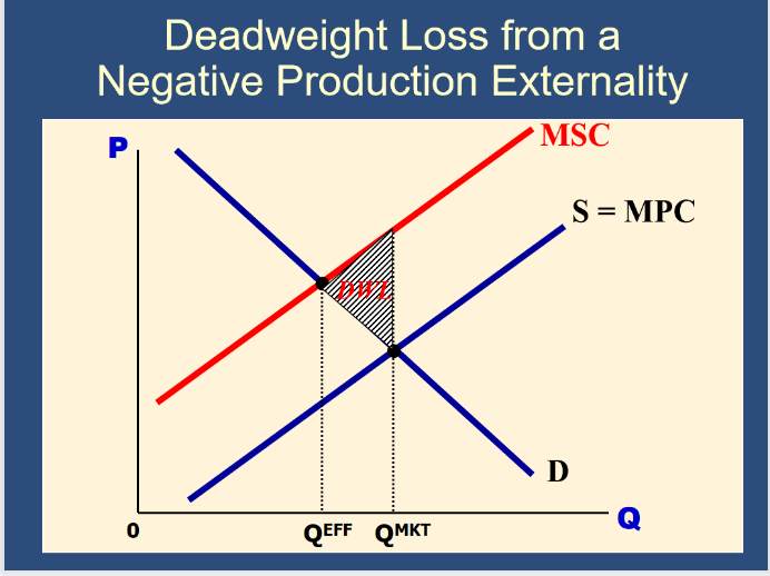
✔ That’s a good, deep question. The DWL is indeed caused by the negative externality. The DWL represents all of the times when the marginal social cost was greater than the marginal social benefit. As a result of the marginal social cost being higher than the marginal social benefit, total surplus declined. The DWL triangle represents the total loss of total surplus due to the over-consumption of the good.
Private Benefits and private costs are the primary drivers of people’s decisions in a market system. Therefore, QMKT is determined by the private lines: MPC and MPB.
In contrast, efficiency is determined by social costs and benefits. Therefore, QEFF is determined by the social lines: MSC and MSB.
Feedback? Email munger.e1010@gmail.com 📧. Be sure to mention the page you are responding to.