🔎 3-D picture of the model
Usually, we visualize good X and good Y in two dimensions. I find it helpful to think of utility as a third dimension.
In the following graph, two of the axes tell us how much we consume of good X and good Y. The height tells of the utility we get from that consumption:
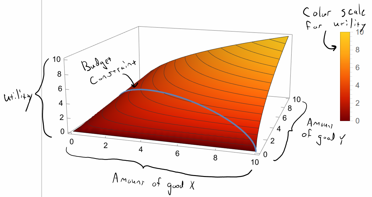
In this graph, we can think of ourselves as a little ant, trying to “climb up mount happiness” to get to the highest point of utility. From the graph, you can see that the highest point of utility is when you consume 10 of good X and 10 of good Y. However, I’ve added a blue budget constraint in there as well. The ant is constrained to stay within the blue budget constraint.
In the graph, I chose a specific function to represent your utility. You won’t be required to do anything like this, so don’t worry!
The black curves in the graph are the indifference curves. Remember that indifference curves are just all of the points where your utility is at some constant level. In the graph, this means that the black curves stay at a constant height (ie z-level or utility-level) in the graph. I have labeled the indifference curves in the following diagram. IC5 shows you all of the baskets of goods where you receive a utility of 5.
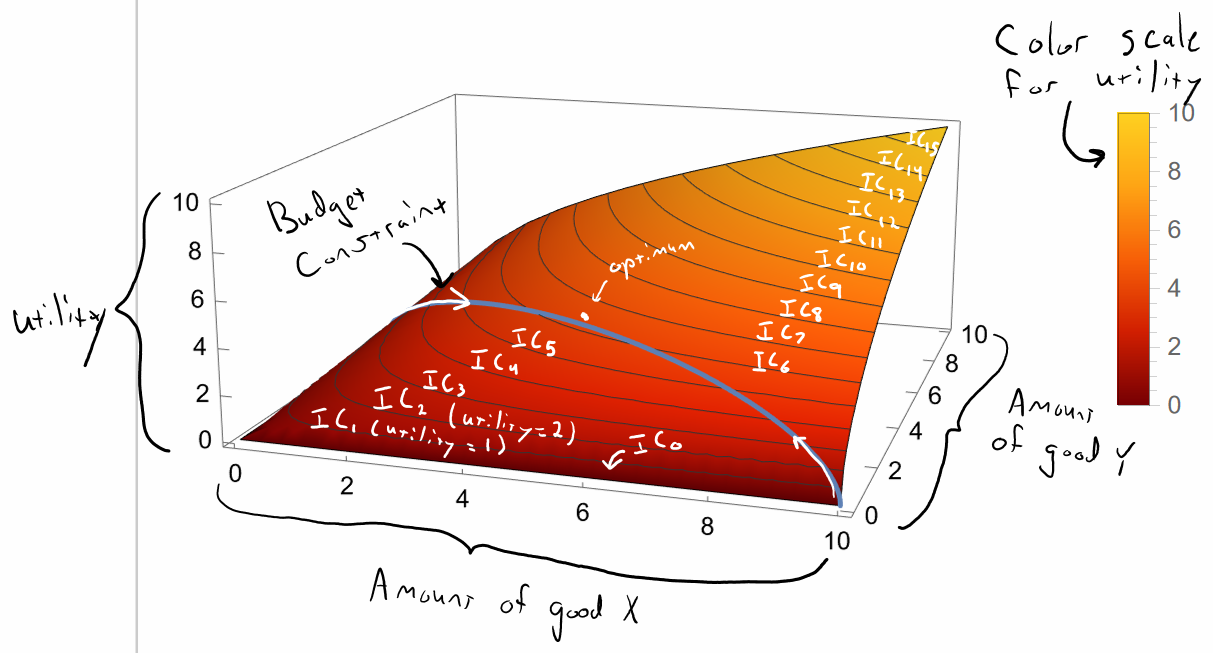
You can also see in the above graph how your utility increases as you slide along the budget constraint toward the optimum closer to the middle. When you consume 10 units of good X and 0 units of good Y, you start off with 0 utility on IC 0. To illustrate this, let’s imagine that goods X and Y are two essential goods, like food and air. If air is like good X and food is like good Y, this is like having lots of food but no air: very low utility. As you slide along the budget constraint toward a more balanced consumption bundle, you get to higher indifference curves with more utility.
Clearly, the highest point is in the middle. I haven’t drawn an indifference curve through that optimal point but there must be an indifference curve through every point, so there is an indifference curve through the optimal point as well. Any graph can only include a finite number of indifference curves or it will be filled with black curves and illegible.
If I rotate that graph and look at it top-down, we see a diagram much like the ones in the slides.
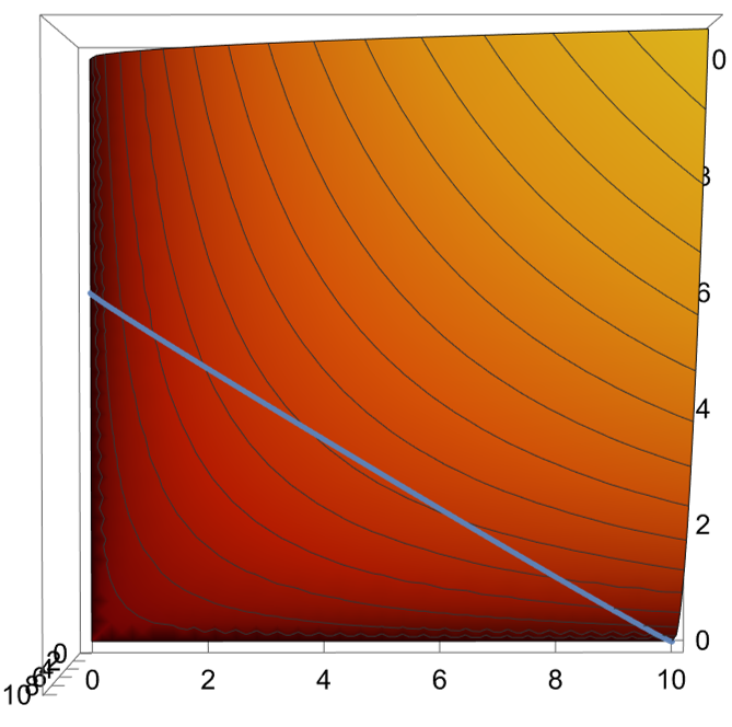
Whenever you see a two dimensional graph like in the slides, see if you can make it “pop out” into three dimensions, and visualize it like you are an ant climbing up and down “mount happiness,” trying to get to the point of highest utility. It helps make the idea of optimization very clear.
Feedback? Email munger.e1010@gmail.com 📧. Be sure to mention the page you are responding to.